grand-kitchen-20 - H&M Interiors
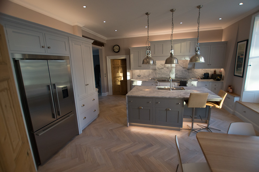
grand-kitchen-20 - H&M Interiors
grand-kitchen-20 handminteriors Album: Suffolk Town Kitchen Details Uploaded January 28, 2017 .gmsingle_clearfix { display:block; } .gmsingle_clearfix::after { visibility:hidden; display:block; font-size:0; content:' '; clear:both; height:0; } .gmsingle_wrapper { margin:0 auto; } .gmsingle_wrapper * { -webkit-box-sizing:border-box; -moz-box-sizing:border-box; box-sizing:border-box; } .gmsingle_photo_header { margin-bottom:15px; } .gmsingle_name_wrap { padding:24px 0 2px 80px; height:85px; max-width:100%; overflow:hidden; white-space:nowrap; position:relative; } .gmsingle_name_wrap .gmsingle_user_avatar { position:absolute; top:20px; left:0; } .gmsingle_name_wrap .gmsingle_user_avatar a.gmsingle_user_avatar_link { display:block; text-decoration:none; } .gmsingle_name_wrap .gmsingle_user_avatar img { height:60px !important; width:auto; overflow:hidden; border-radius:3px; } .gmsingle_name_wrap .gmsingle_title_author { display:inline-block; vertical-align:top; max-width:100%; } .gmsingle_name_wrap .gmsingle_title_author .gmsingle_title { text-rendering:auto; font-weight:100; font-size:24px; width:100%; overflow:hidden; white-space:nowrap; text-overflow:ellipsis; margin:0; padding:1px 0; height:1.1em; line-height:1; box-sizing:content-box; text-transform:none; letter-spacing:0px; text-transform:capitalize; } .gmsingle_name_wrap .gmsingle_title_author > div { font-size:14px; } .gmsingle_name_wrap .gmsingle_title_author .gmsingle_author_name { float:left; } .gmsingle_name_wrap .gmsingle_title_author a { font-size:inherit; } .gmsingle_photo_info { display:flex; flex-wrap:wrap; } .gmsingle_details_title { margin:0; padding:0; text-transform:uppercase; font-size:18px; line-height:1em; font-weight:300; height:1.1em; display:inline-block; overflow:visible; border:none; } .gmsingle_description_wrap { flex:1; overflow:hidden; min-width:220px; max-width:100%; padding-right:7px; margin-bottom:30px; } .gmsingle_description_wrap .gmsingle_terms { overflow:hidden; margin:0; position:relative; font-size:14px; font-weight:300; } .gmsingle_description_wrap .gmsingle_term_label { margin-right:10px; } .gmsingle_description_wrap .gmsingle_term_label:empty { display:none; } .gmsingle_description_wrap .gmsingle_terms .gmsingle_term { display:inline-block; margin:0 12px 1px 0; } .gmsingle_description_wrap .gmsingle_terms .gmsingle_term a { white-space:nowrap; } .gmsingle_details_section { flex:1; width:33%; padding-right:7px; padding-left:7px; min-width:220px; max-width:100%; } .gmsingle_details_section .gmsingle_slide_details { margin:20px 0; } .gmsingle_location_section { flex:1; width:27%; padding-right:7px; padding-left:7px; min-width:220px; max-width:100%; } .gmsingle_location_section .gmsingle_location_info { margin:20px 0; } .gmsingle_location_section .gmsingle_location_info * { display:block; } .gmsingle_location_section .gmsingle_location_info img { width:100%; height:auto; } .gmsingle_badges { border-bottom:1px solid rgba(0, 0, 0, 0.1); padding-bottom:17px; margin-bottom:12px; text-align:left; font-weight:300; } .gmsingle_badges__column { display:inline-block; vertical-align:top; width:40%; min-width:80px; } .gmsingle_badges__column .gmsingle_badges__label { font-size:14px; } .gmsingle_badges__column .gmsingle_badges__count { font-size:20px; line-height:1em; margin-top:1px; } .gmsingle_exif { border-bottom:1px solid rgba(0, 0, 0, 0.1); padding-bottom:12px; margin-bottom:12px; text-align:left; font-size:14px; line-height:1.7em; font-weight:300; } .gmsingle_exif .gmsingle_camera_settings .gmsingle_separator { font-weight:200; padding:0 5px; display:inline-block; } .gmsingle_meta { padding-bottom:12px; margin-bottom:12px; text-align:left; font-size:14px; line-height:1.2em; font-weight:300; } .gmsingle_meta .gmsingle_meta_key { float:left; padding:3px 0; width:40%; min-width:80px; } .gmsingle_meta .gmsingle_meta_value { float:left; white-space:nowrap; padding:3px 0; text-transform:capitalize; }
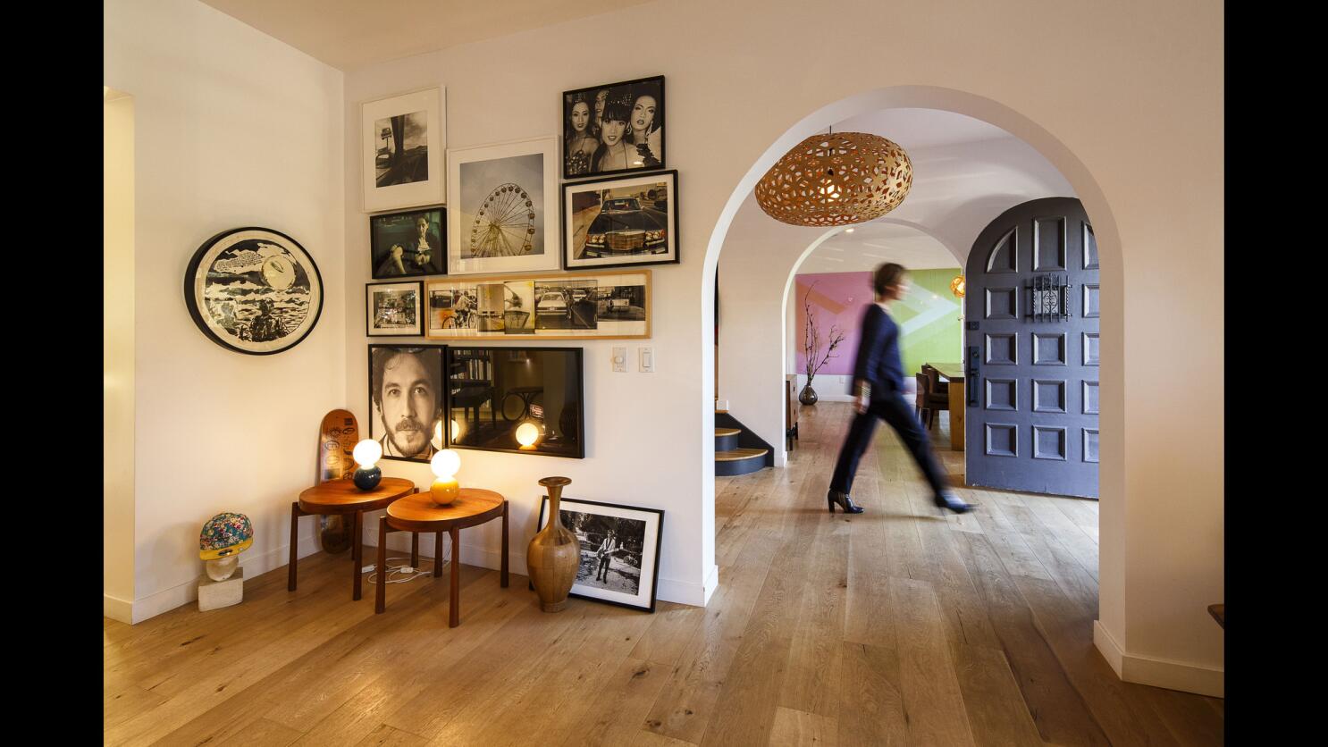
In their world of change, couple modernizes a Los Feliz home - Los Angeles Times
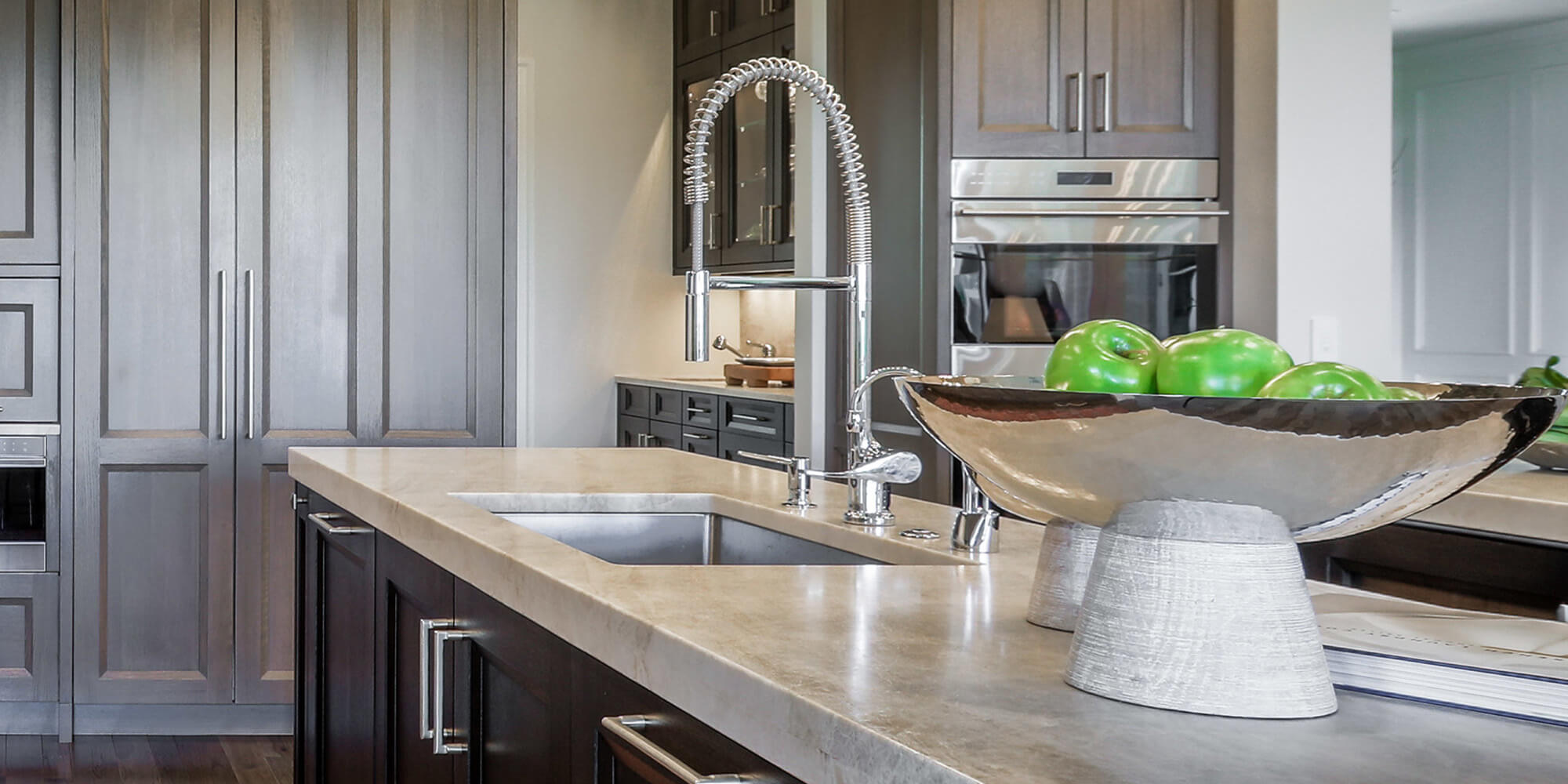
Modern Kitchen Cabinet Styles and Finishes
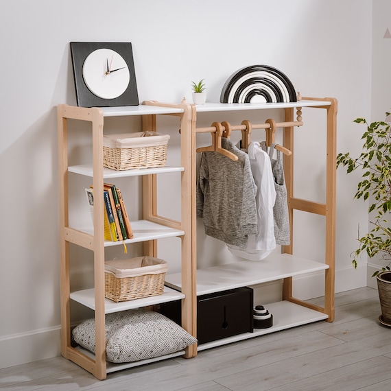
Child Montessori Clothing Rack Type B With Shelf Combined With MAXI Shelf Kid Wardrobe Kindergarderobe Gift for Kids

H&M hopes to boost business at Northpark Mall
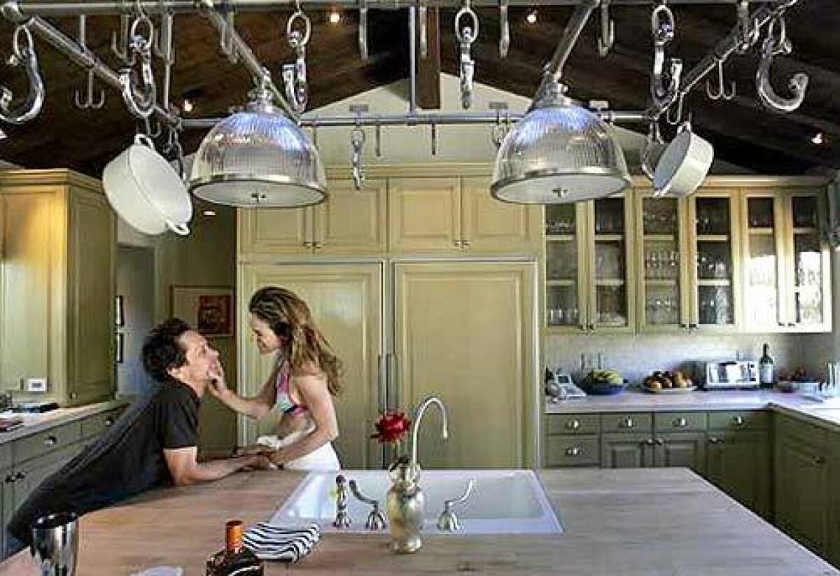
The high life without airs - Los Angeles Times
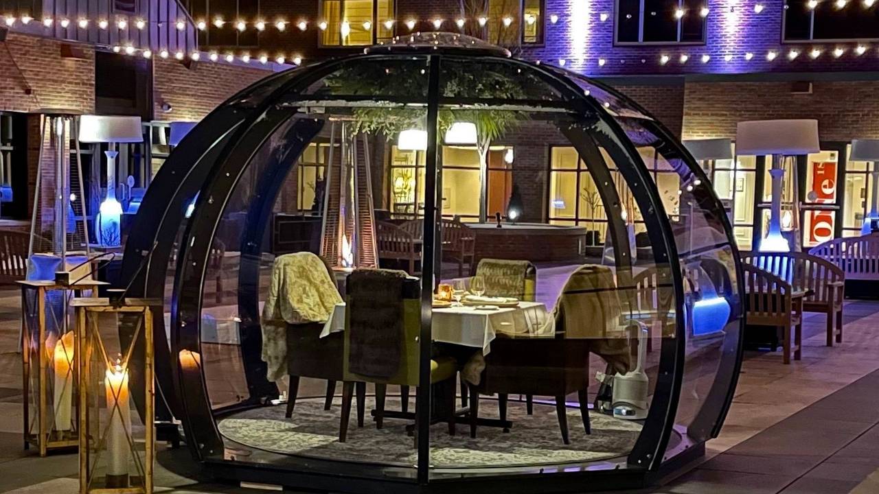
H Hotel Dining Pods Restaurant - Midland, MI
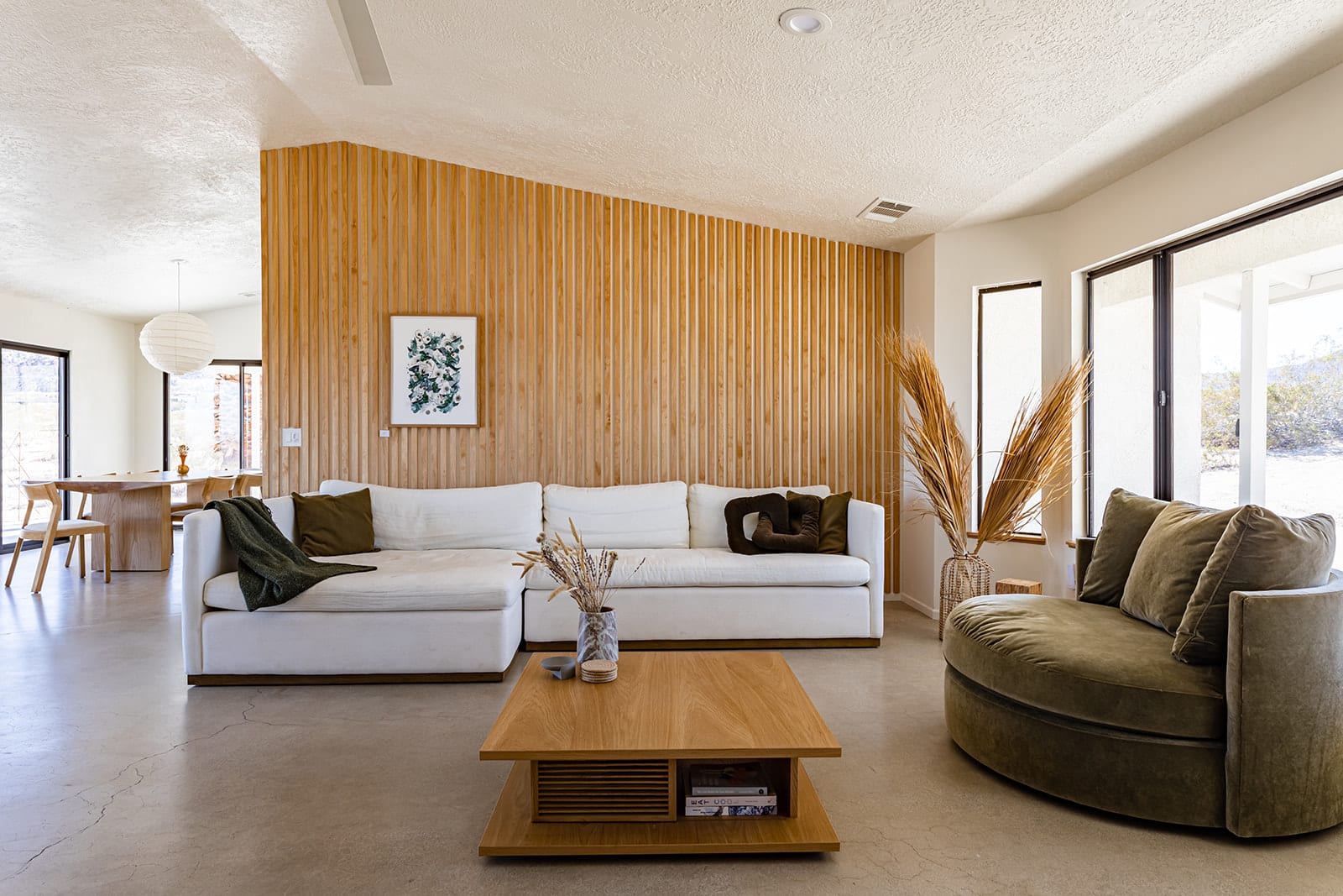
CHI House Serene Joshua Tree Retreat I Spa Pool - Homestead Modern, LLC

H&M Logistic Office / JC Architecture

COhatch Beachwood, North High Brewing set grand opening
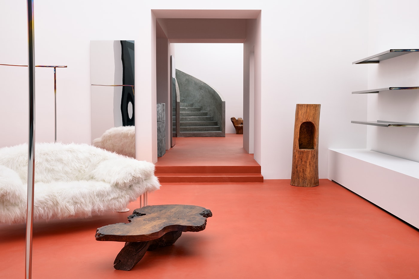
Profan Creates Revamped Flagship for Filippa K


